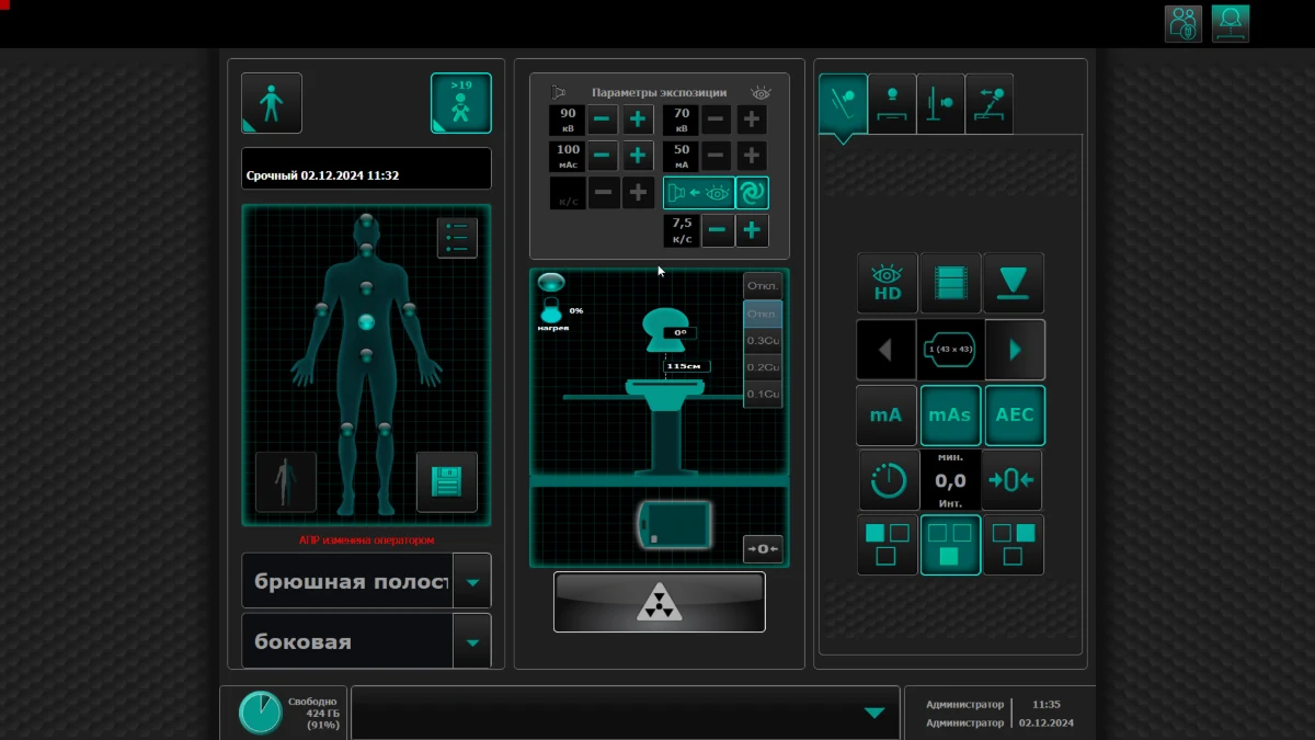
The interfaces across the product line all looked different, and developers hand-coded every component from PNG mockups. I built a UI kit, grew it into a design system and produced the components by vibe coding.
The company’s interfaces each lived their own life. There was no shared structure, the products looked different from one another, and no single brand came through. New flows had been piled on top of old ones for years, so the interfaces grew heavy — visually and functionally. Every new feature was written into the manual, which by then had grown past 100 printed pages that medical staff were expected to read before starting work.
01Different visual approaches inside a single company
02A printed manual for medical staff as the entry point into the interface
03Every component hand-coded by developers from PNG mockups
04Design debt growing, with no way to run a quick audit
02Design audit
I started with an inventory: went through the existing interfaces and marked what repeated and what was unique. The audit showed that consistency between the interfaces of one company was almost non-existent. Every device got its own look, barely related to its siblings. At the same time, the markup for any new component was written by hand from a PNG image, which took developers a lot of time for such a routine task. Design audits in this setup usually failed, and code review dragged on because different developers wrote components in different ways. Onboarding new colleagues was hard too — nothing was unified, neither in design nor in code.
Area
What is wrong
What we propose
Typography
No clear visual hierarchy
Low text contrast
Broken letter spacing
Introduce a type system: H1, H2, H3, Body, Caption, Label
Set correct tracking and leading
Pick text colours to meet WCAG AA — contrast 4.5:1 and above
Colour
Too many shades of the brand colour
No systematic palette
Design a primary and an accent palette
Introduce system colours and their states
Icons
Icons drawn in different styles
Inconsistent sizes and colours
Unify the icon set
Draw custom icons for domain-specific functions
Write a guide on using icons
Buttons, inputs and selects
Elements styled inconsistently
No states
Bring the elements to one UI style
Add every system state
Set shared rules for spacing, shadows and radii
Grid and spacing
No single spacing system
Elements look out of sync
Introduce an 8pt grid
Define rules for inner and outer spacing
Write a guide on using spacing
Accessibility
No focus states
Forms and tables unreachable by keyboard
Add focus rings
Check accessibility against WCAG
Improve keyboard navigation
The audit across six areas: what we found and what we proposed instead
03The UI kit and the move to a system
Together with the second designer we redesigned the first screens and got the direction approved by the stakeholder. Then I built a UI kit covering every component on those screens. While working on it I realised that larger changes were needed, so I decided to get a design system project approved. I ran a presentation for management about the need for a single design system — to speed up production and to scale the brand. After that I talked to the developers and explained how the system would affect their day-to-day work, and why production had to move away from legacy. Some supported the idea, others insisted on the familiar way of working. I decided to start on the design system, move a few screens fully onto components, offer a test drive to the part of the engineering team that was on board — and, if it went well, present the switch together with them to the sceptical half.
01Redesign of the first screens, direction approved
02A UI kit with full component coverage
03Defending the move from a kit to a system in front of the stakeholder
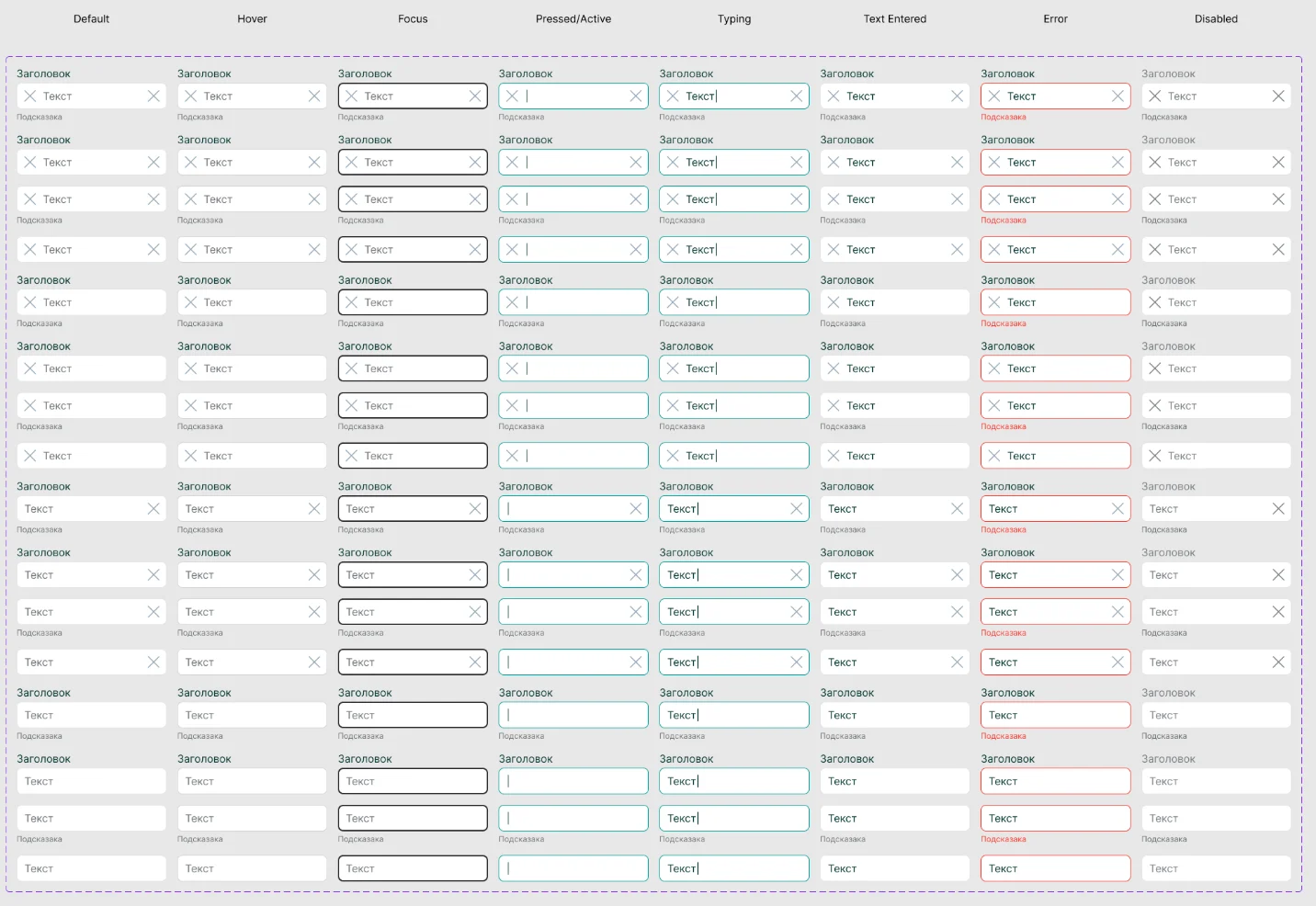
Input field. 8 states, including typing and filled — the two that usually get forgotten
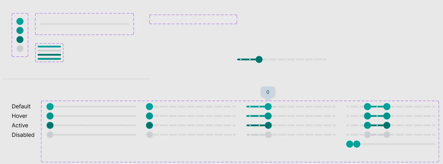
Slider. Four kinds — plain, with ticks, with a value and a range — in four states each
Part of the set
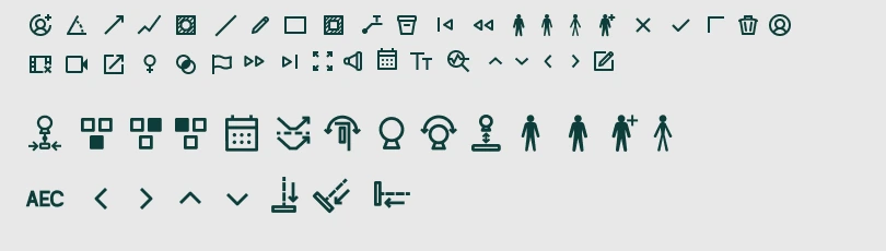
Icons. A shop window, not the whole set. It was drawn for equipment functions that no ready-made library covers
01 / 03
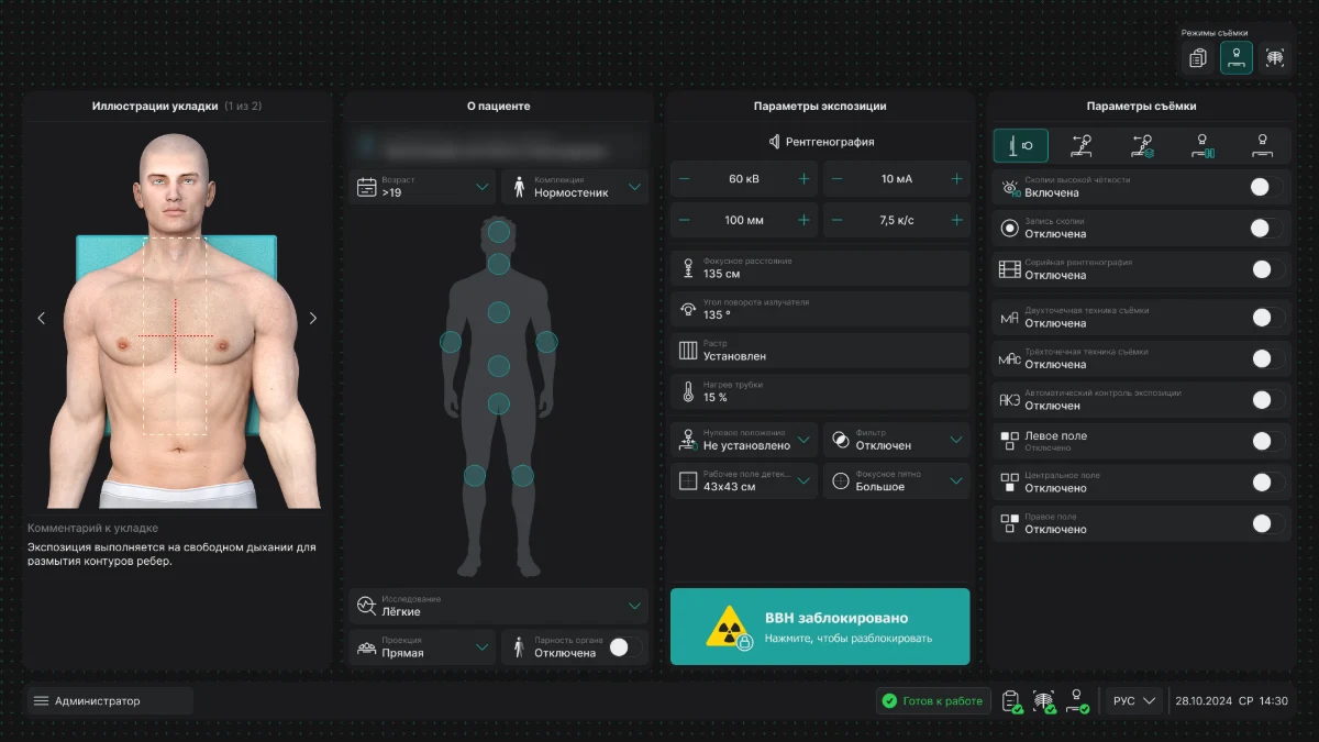
The system on a real screen
BEFOREAFTER
These are the very first screens the kit was assembled from
The buttons, fields and selects on them come from the library, not drawn again
A closer look at this redesign is in case 02
04Components through vibe coding
There were not enough developers to set up the library: they were busy with the product, and every component additionally went through a long code audit. I proposed building the components with AI and vibe coding — and defended the decision. That made it possible to keep growing the design system without pulling engineering away from their work. Vibe-coded components went through a quick code review to catch the model’s mistakes, and were then approved in Storybook.
01The reason: not enough developers and a long code audit
02The routine of producing components went to AI
03Decisions and rules stayed with design
LIVE COMPONENTS
STATE
ICONS ON BOTH SIDES
ICON ON THE RIGHT
ICON ON THE LEFT
NO ICON
ICON ONLY
TOKENS
Default#20a19b
Hover#00948f
Pressed#113a38
Focus#0a84ff
Disabled#383b3d
Error#ff453a
STATE
WITH A LABELRequired field
WITH HELPER TEXTHelper textRequired field
WITHOUT A LABELRequired field
TOKENS
Default#f8f9f9
Hover#f5f5f5
Focus#bfe8e6
Error#ffcecb
Focus border#20a19b
Error border#ff453a
RESULT
A week → three working days
The time a designer needs to assemble a typical screen feature dropped from a week to three working days: the components and tokens already exist, so there is nothing left to invent or re-approve. The radiographer interface — case 02 — is built on this system.
Anastasia Kuratnik
Product Designer (UX/UI)
Four years in design, a year and a half of them in product. I design complex desktop and web interfaces, build design systems and get them adopted. I run research: in-depth interviews, surveys and usability testing — with doctors and domain specialists. I have worked with clients from Belarus and Kazakhstan.
LOCATION
Saint Petersburg, open to relocation
FORMAT
Remote, hybrid or on-site
EMPLOYMENT
Full-time
LANGUAGES
Russian — native, English — intermediate
EXPERIENCE
«Electron»
May 2025 — present
Product designer, design system designer · Medical diagnostic equipment · Saint Petersburg
I own the interfaces of X-ray equipment at every stage: researching how doctors actually work, design, handover to engineering, design review.
The devices in the product line had grown apart from each other — there was no shared component library at all.
Made the case to stakeholders for moving to a single design system, with an estimate of time and development cost. Got approval and started the project.
Built the design system and wrote the technical documentation for engineering.
Cut the time a designer needs to assemble a typical screen feature from a week down to three working days.
Used it as the basis for redesigning the interfaces across the company’s whole product line.
Ran in-depth interviews and surveys with doctors and domain specialists — and corrected the user flows before development started.
Produced wireframes and interactive prototypes within the constraints of the desktop platform.
Pyrus agency
February 2025 — February 2026
UX/UI designer · Marketing agency · Belarus
Landing pages, multi-page sites and promo pages with responsive versions; banners, social media, ad creatives, presentations, outdoor advertising.
Ran competitor and audience analysis, and built user flows on top of it before moving to layouts.
Designed logos and identity, worked with clients’ brand books, prepared micro-animations and handed layouts over to development.